Just hours after photos leaked of the upcoming Tesla Model 3 refresh, codenamed “Project Highland,” Tesla has officially unveiled its highly-anticipated facelift in Europe.
The refresh includes a “facelifted” front-end design, interior changes like more screen space (including a new rear display), and increased range. Tesla says that the refresh replaces more than half of the parts in the vehicle, though we’re not exactly sure how it measures that metric.
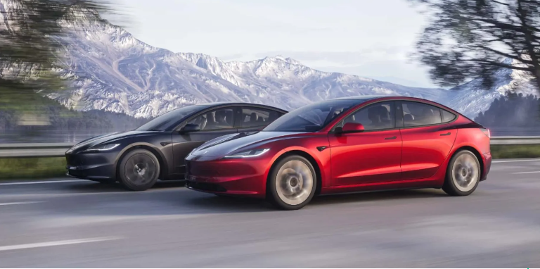
The most striking change is obviously the new design, which keeps most of the same look of the current Model 3, but changes the front end to look sleeker, removing the somewhat bulbous bump in the front end of the current Model 3.
We saw this front end in a leaked photo back in April, and it looks like it was the real thing all along. Now we have actual photos from Tesla, so you can see the changes in their full glory.
These photos show the new “Ultra Red” color, replacing the current red multi-coat. But this color may only be available in Europe – we’ll have to wait for more word from Tesla on this one.
The headlights have also gotten narrower and more aggressive-looking, in keeping with the general changes to make the front end look sleeker.
Tesla says that the refreshed Model 3 will have longer range, rated at 344 miles WLTP for the SR RWD version, and 421 miles WLTP for the LR, both with 18″ aero wheels. These numbers are an 11-12% improvement from WLTP ratings for the current Model 3.
But note that those are WLTP numbers, so they’re bigger than the US EPA numbers will be when they come out. If we expect a similar 11-12% improvement, then you’ll see roughly a ~300 mile EPA range on the SR and ~370 miles on the LR.
This increased range largely comes from improvements in aerodynamics, with a lower and less bulbous front end, channeling air around the vehicle more effectively. This has resulted in a Cd of .219, Tesla’s lowest yet (down from .225 on the current Model 3), which improves range by 5-8% on its own.
Another improvement is new wheel cover inserts which strike a compromise between consumers’ desires for larger-looking wheels and more range. Aerodynamic wheel inserts can increase range by a lot, but many think the wheels look better without the caps on (personally, I disagree, but whatever floats your boat).
There is a significant slate of interior changes as well:
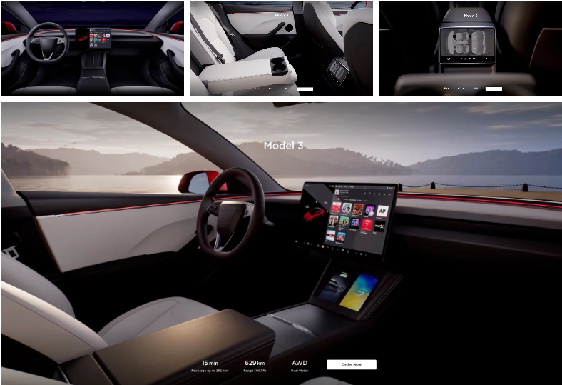
A new rear 8-inch touchscreen, giving rear seat passengers control over climate change and entertainment
Deleted stalks on the steering column, much as in the Model S and X, with the gear selector now on the touchscreen and turn signal buttons on the left side of the steering wheel
Ventilated front seats, which can be controlled from outside the vehicle through Tesla’s phone app, heating or cooling them up before you get in the car
Cushier rear seats (now perforated, but not ventilated like the front seats)
The sound system has been upped to 17 speakers (from 14)
Improved bluetooth microphone performance
Improved wi-fi and bluetooth for better connectivity to routers and phone keys
A quieter interior than on the original Model 3, due to several changes to aerodynamics and materials
Customizable interior ambient lighting
Larger rear trunk, up to 594 liters from 561

Changes are now live on Tesla’s European sites, where the refreshed Model 3 is now available for order.
Deliveries begin in October (right after Tesla’s shameless FSD transfer scheme expires) in left-hand drive markets in Europe and the Middle East. Tesla has not yet announced when deliveries begin for North America (or for RHD markets like the UK). We don’t have pricing for North America yet, either, but in Norway for example, the SR version is the same base price as before, and the LR version is 10,000 NOK (~$941 USD) more expensive. So far, no performance Highland version has been announced.
Electrek’s Take
We’ve expected this refresh for quite a while now, but now that we see it, it’s a lot more extensive than we had imagined it would be.
The front end changes have been well documented, but the significant overhaul of the interior is quite a lot more than we thought it would be.
I personally love most of the changes, but am not a fan of the new steering wheel. While I haven’t tried this specific one, the “yoke” wheel on the Model S was not that pleasant to use. I’m sure it would be fine after getting used to it, but turn signal stalks are just so convenient and familiar, and I don’t like the change to buttons.
Top comment by CMG30 Liked by 7 people
It will be interesting to see the tear downs of this and get an idea of exactly what they've changed. The only disappointment for me so far is the lack of stalks. I've seen enough of the buttons to know they're the 2nd best option. I know that some out there will defend them to the death, and that's fine. I can only relay my opinion.
View all comments
Same for using the screen for gear selection, which just feels kludgy – though that command isn’t used nearly as often as the turn signals, so it’s not as offensive to me personally.
And, lest you think I am merely a luddite, recall that in our original Model 3 review, I raved about almost everything about this car, including the changes that many considered odd. It was and is an exceptional vehicle, and the Highland changes do not change that on balance.
We’ll have to wait and see if changing 50% of the parts in the car results in a few glitches here and there with early models, but Tesla has gotten a lot better at manufacturing since the early days, so hopefully it won’t be too bad. Even my early Model 3 (VIN ~2500) has been mostly free of problems (except for the stinky feet air conditioning issue – it remains to be seen if Tesla has finally solved this with Highland, but we sure hope they have).
What do you think of the new Project Highland Model 3 Refresh? Let us know in the comments below.